A mall that brings new meaning to value
Overview
The Problem
Grant Park was looking for a way to communicate their new updates and additions to their shopping centre. They needed a campaign that communicated that not only did the mall look different, but the shopping centre had been revitalized to reflect the surrounding community’s wants and needs. Grant Park was looking to reinvigorate their appeal in the neighbourhood.
Grant Park Shopping Centre
Grant Park Shopping Centre (Grant Park) is a 70-shop, nearly 400,000 square foot shopping centre in southwest Winnipeg. The shopping centre updated its interior in anticipation of the arrival of several large tenants.
Research, Insights and the Audience
Analysis
We analyzed how Grant Park positioned itself by evaluating its current brand identity alongside its current customer base, and we conducted interviews with Grant Park’s current audience.
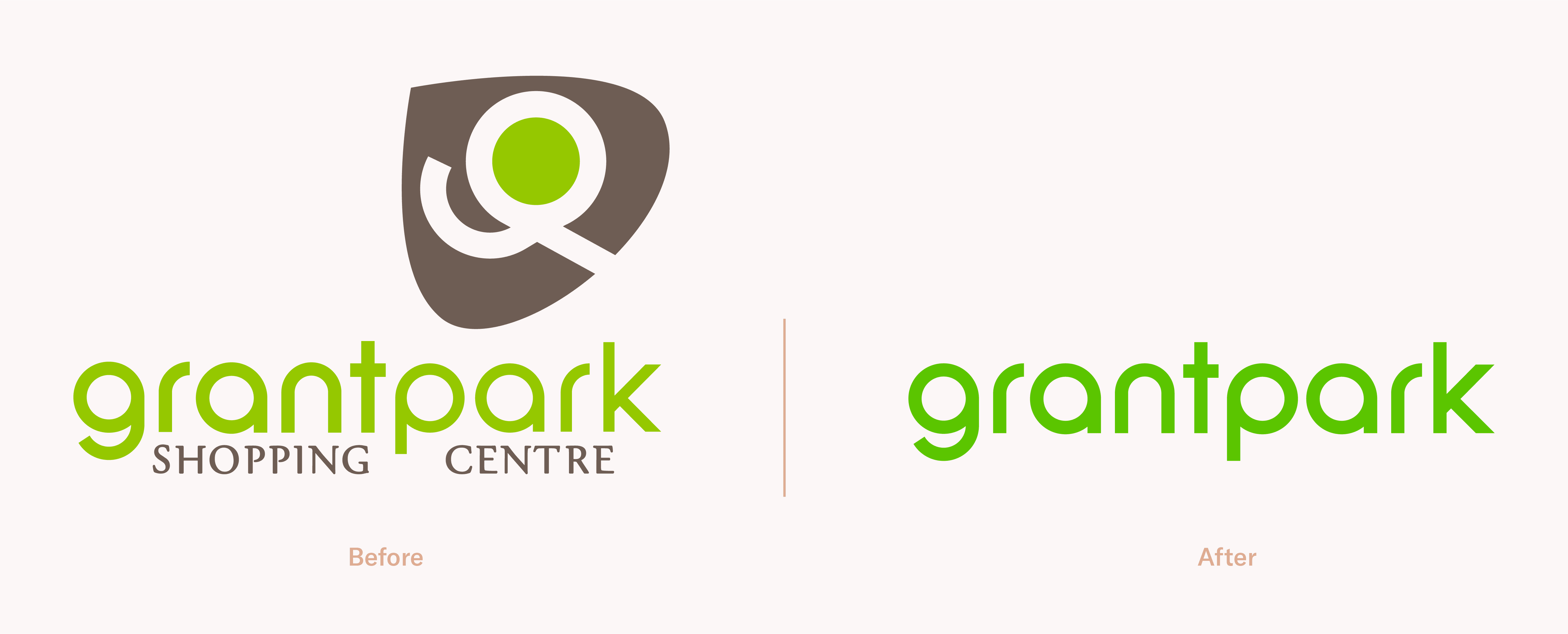
We also evaluated Grant Park’s current brand identity. Due to the mall’s previous exterior renovations, several core aspects of the previous visual identity needed to remain unchanged.
With these considerations in mind and in combination with our research, we developed these insights.
Creating differentiation through positioning
Insight #1: A shopping experience for everyday life
Grant Park is different from typical malls in that it doesn’t have a large suite of major clothing/fashion-based tenants. Based on our initial analysis, Grant Park hosts shops and services that supplement the day-to-day life of its patrons: groceries and amenities, fitness facilities, electronics, specialty needs and entertainment.
With this roster of tenants, it was clear that there was an opportunity to position Grant Park with a value proposition unique from other malls. Unlike most shopping centres, Grant Park actually saves its patrons time–as opposed to a destination mall where shoppers are encouraged to stay and shop for extended periods.
Keeping the audience’s needs and motivations at the forefront
Insight #2: Time (and utility) is on our side
In speaking to a number of locals within our target audience, we found that people wanted to accomplish more in their lives but couldn’t find the time to get it all done. Grant Park allows those people to not only cover the basics, but do so more efficiently giving people back the time they want for themselves.
“Time” was a key insight and the foundation for the development of our approach and strategy for Grant Park.
With its suite of utility-focused tenants, the essential value proposition of what Grant Park offers is time.
Audience
Grant Park has traditionally served a variety of customers with seniors and baby boomers representing a large part of their audience.
With their rebranding, Grant Park wanted to shift the perception of their shopping centre away from a “seniors’ mall” and hangout for high-schoolers (due to their proximity to Grant Park High School).
In order to shift the perception, we worked with Grant Park to target a new audience. We determined professionals and families between the ages of 24-35 would be the primary target audience. This group has above-average amounts of disposable income, but also values convenience and service over price.
Our research broke this target audience group into two categories:
Having identified our new target groups and distilled our research into insights, we began to identify the challenge our brand strategy and campaign would answer.
The Challenge
Direction
Our work needed to showcase the new additions coming to Grant Park while repositioning the brand to reflect the shopping centre’s value.
The value:
Grant Park allows patrons to not only cover the basics, but also gives people the opportunity to save valuable time and get more out of life.
With this understanding, we could develop a brand campaign that positioned the shopping centre as valuable to their existing patrons while attracting new audiences.
Brand Strategy
Campaign
The heart of the value proposition
It was critical our messaging spoke to our value proposition: time. However, we also needed to incorporate the tenants into the messaging to give them a platform to communicate their value as part of the mall.

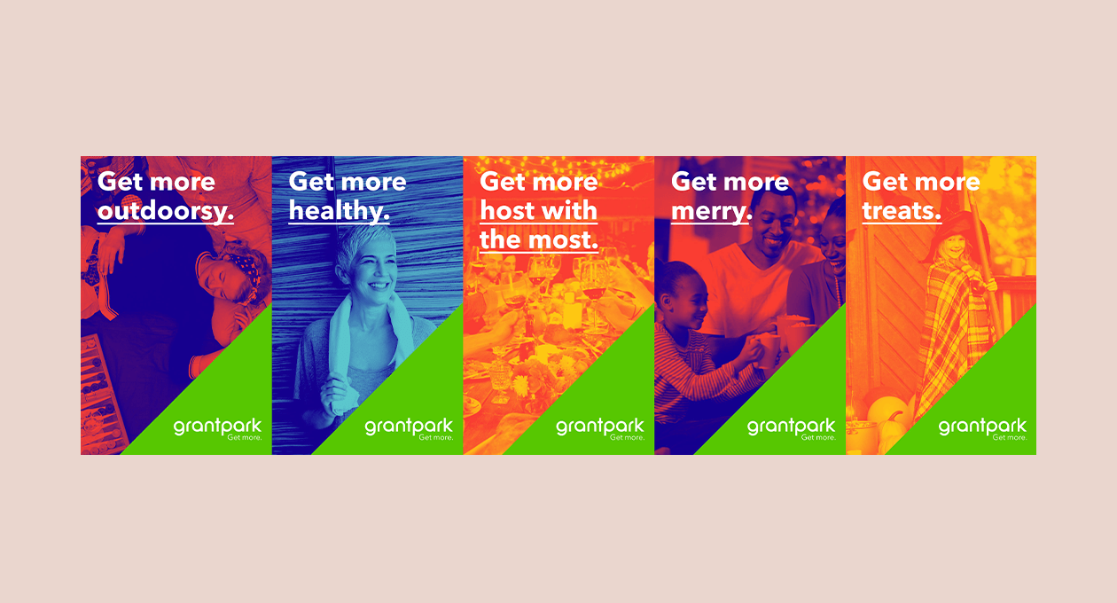
The cornerstone of our messaging, “Get More” was strong and flexible enough to accomplish just that. This phrase serves as both a declarative statement, as well as a call to action, and it allows us to communicate the value proposition—Get more time and get more out of life. It also contextualizes the sum of all of the services Grant Park has to offer.
Messaging that works
This paved the way for a sophisticated messaging system that paired well with Grant Park’s offerings. This messaging system used the tagline, “Get More,” as the vehicle to translate and reinforce our main value proposition.
The power of this new positioning is its flexibility. We wanted to illustrate that the sum of the mall’s parts are greater than any one store or service alone. Grant Park gives everyone the moments in life that only time can buy.
From here, we were ready to bring our messaging and identity work together for the campaign.
Execution
Campaign visuals
Get More Campaign
In order to bring “Get More” to life, we established an identity for the campaign that would integrate with Grant Park’s existing identity. We also cleaned up the existing identity to achieve the goals laid out in our brand strategy.
Colour
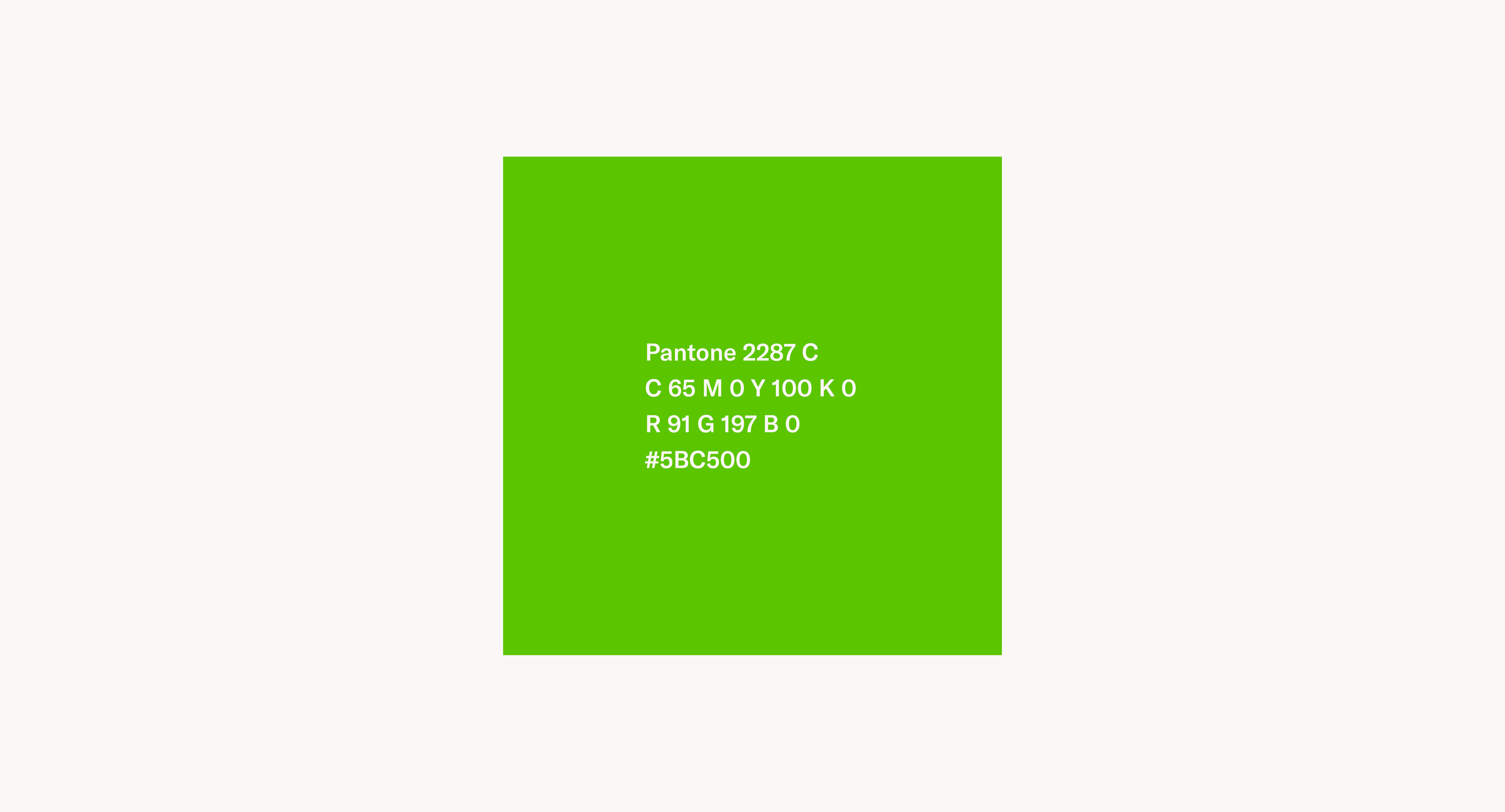
Prior to working with us, Grant Park was using a mixture of earthy, outdated tones that failed to convey the excitement and growth happening inside the mall. To modernize their colour palette, we referenced portions of the new exterior and chose bright green as Grant Park’s new primary colour. This strategy used one recurring colour with an already established association with the mall.
Supplementary Colour Palette
A supplementary palette of bright, fun colours were created to help the branding stand out. This palette visually conveyed the positive message behind “Get More.” These colours were used to treat the photos as a two-colour (or duotone) image to create an interesting and appealing overall look for branded materials. From this palette, colours were paired up in the brand guidelines in order to ensure continuity and recognition across all platforms.
Photography
To visually communicate “Get More” we used lifestyle photography emphasizing people taking a moment to enjoy life combined with the “Get More” messaging. The photography illustrated the value proposition and communicated the benefits of having access to Grant Park’s many utilities.
With a finalized campaign concept and updated identity, we were ready to start developing assets that would bring “Get More” into the real world.
We developed an implementation plan to roll out the campaign throughout the primary target area and within the interior of the mall.
Content Assets
One of the stand-out features of the “Get More” campaign is its flexibility. It allows Grant Park to campaign in a variety of different ways.
Outdoor assets
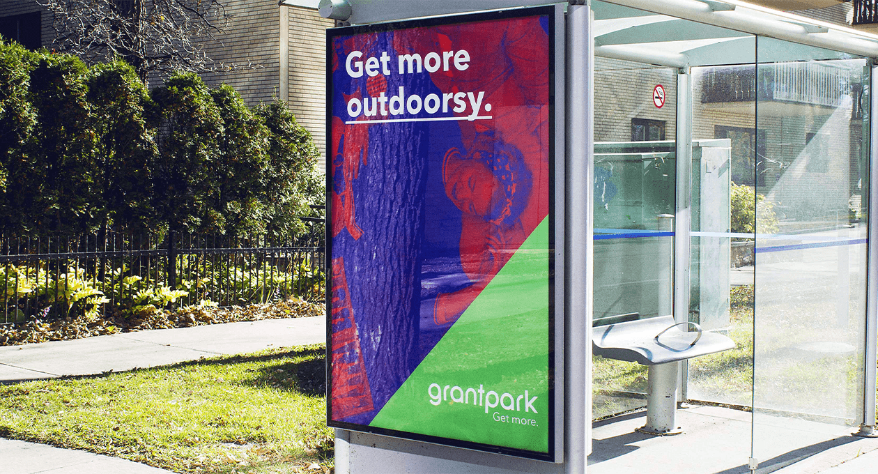
To drive the new target audiences towards the mall, we focused on creating awareness in areas where our target audience lived. We developed materials and rolled out the campaign on billboards, digital billboards and bus shelters.
Social assets
We created new social media assets and introduced these assets across all of Grant Park’s social media platforms. In addition, we worked to develop micro-content schemas that would help Grant Park quickly create content using their internal resources. This allowed Grant Park to use their branding consistently on social media.
Interior assets
A series of custom assets were developed and used throughout the mall’s interior. This series included a large branded wall cover, door decals, show card holders, and various in-mall advertising assets. These added to the vibrancy of the mall and promoted the campaign to patrons visiting the mall.
Results
Outcome
“Get More” was built to communicate the shopping experiences at Grant Park and the multitude of experiences you have there.
This messaging appeals because it’s dynamic and engaging while appealing to a new audience by understanding what they need from their community shopping centre.
This campaign re-positioned Grant Park as the one-stop-shop for consumers to get things done efficiently which meant more time for their patrons to do the things they love.

