Because of the inherent complexity of MIG’s business, it was important to create a messaging framework that structured the flow of information —making their communication clear, informative and relevant.
We developed a messaging hierarchy that flows from top-level positioning down through messaging pillars, where they are manifested into statements that support the core brand proposition.

The result is a structured mechanism for rapidly aligning communication through a set of distinct themes, supporting the overall brand proposition down to the individual product level.
The Design Strategy
Identity had a strategic role to play in establishing MIG’s new brand position. It needed to look ‘buyer friendly’ and send a clear message that MIG was unlike any other insurance brokers.
By creating a brand story for MIG that imagines “a world where insurance is bought, not sold,” we knew the brand identity needed to fully illustrate that idea.
Colour
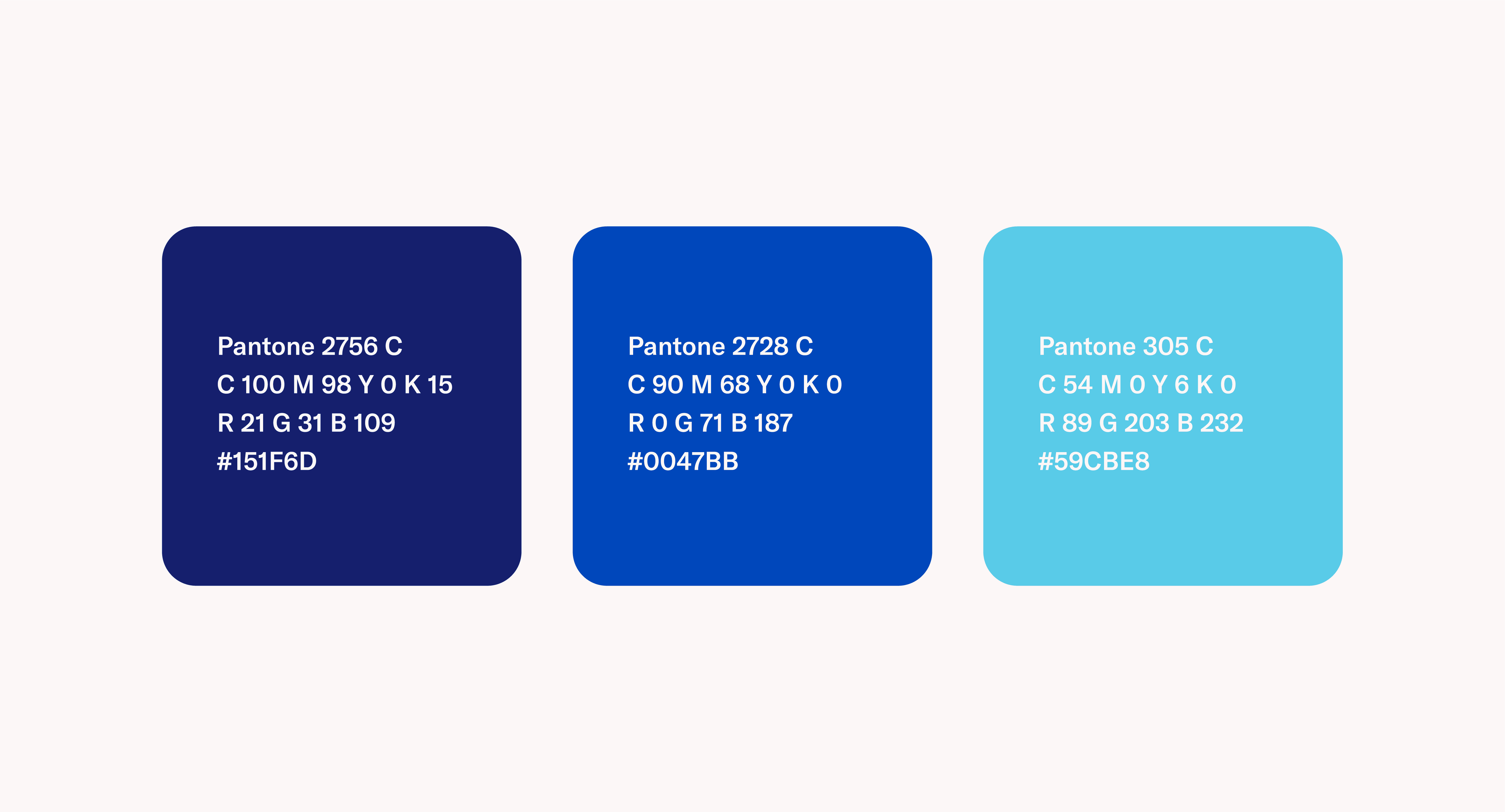
MIG has always been a “blue” company. We wanted to build off of this brand colour and make it more clean, friendly, and inviting. We expanded their range of blues to incorporate a medium blue (MIG Cobalt) and a light blue (MIG Sky Blue).
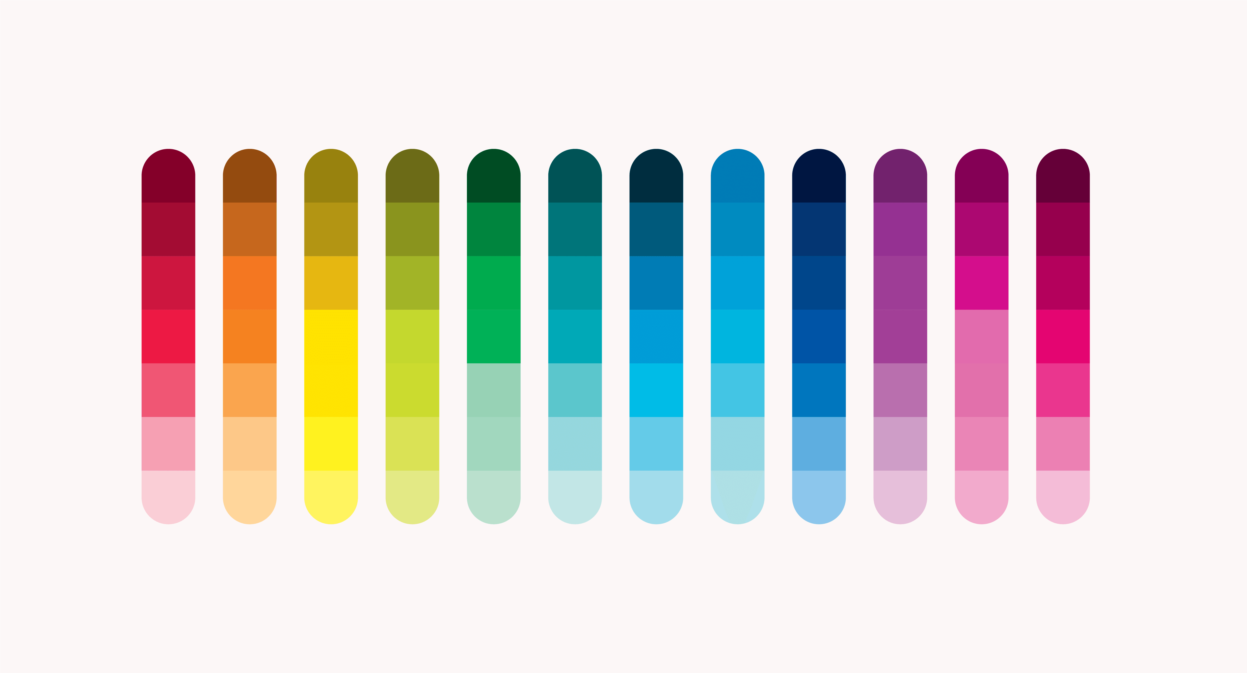
In order to support MIG’s complete visual language, an extensive supplementary palette was developed. The supplementary collection was made up of a colour wheel with 12 base colours including three tints and three shades for each. This added up to a total of 84 colours.
We gave the colours a numeric system where 400 represents the base colour, and 100 and 700 represent the lightest and darkest respectively. This aids in the identification and classification process.
This palette was then extended further to include 13 skin tones and 14 cool and warm grays each. This gave us 125 unique colours to help bring MIG’s brand-world to life.
Each colour was derived from Pantone’s bridge series to ensure consistency across all print and digital channels.
Typography
Typography is central to communicating brand character and value. It was important for our type choices to feel friendly and slightly playful, as well as accessible with a focus on readability. We also wanted the type to pay respect to MIG’s origins and to provide some continuity from MIG’s previous identity.
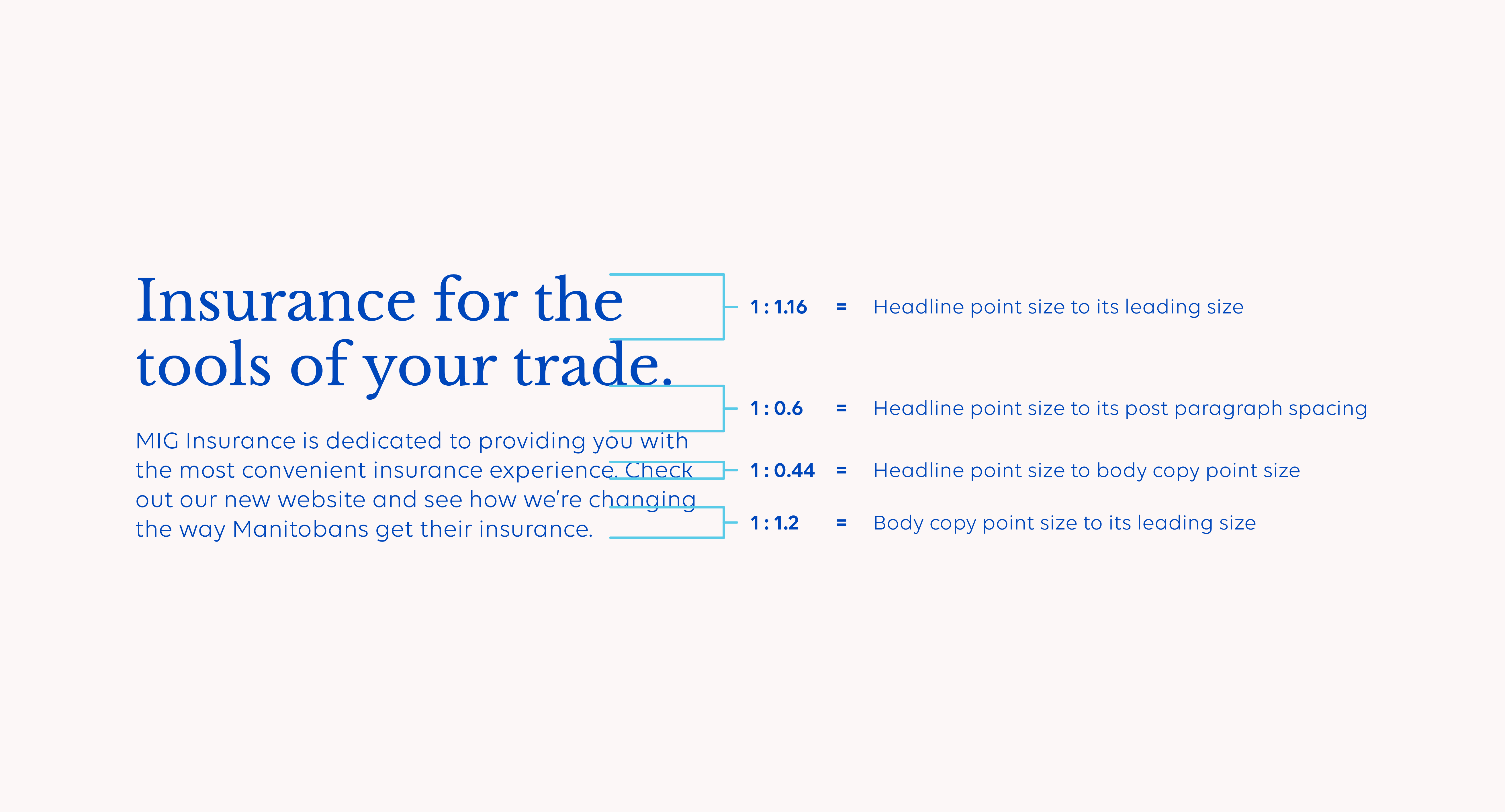
We chose Libre Baskerville and Volte. These typefaces expressed the essence of MIG’s commitment to a clear and simple user experience and were in keeping with the positive aspects of MIG’s brand character.
To keep branded communication consistent throughout all channels, a typography sizing ratio system was created.
Shapes
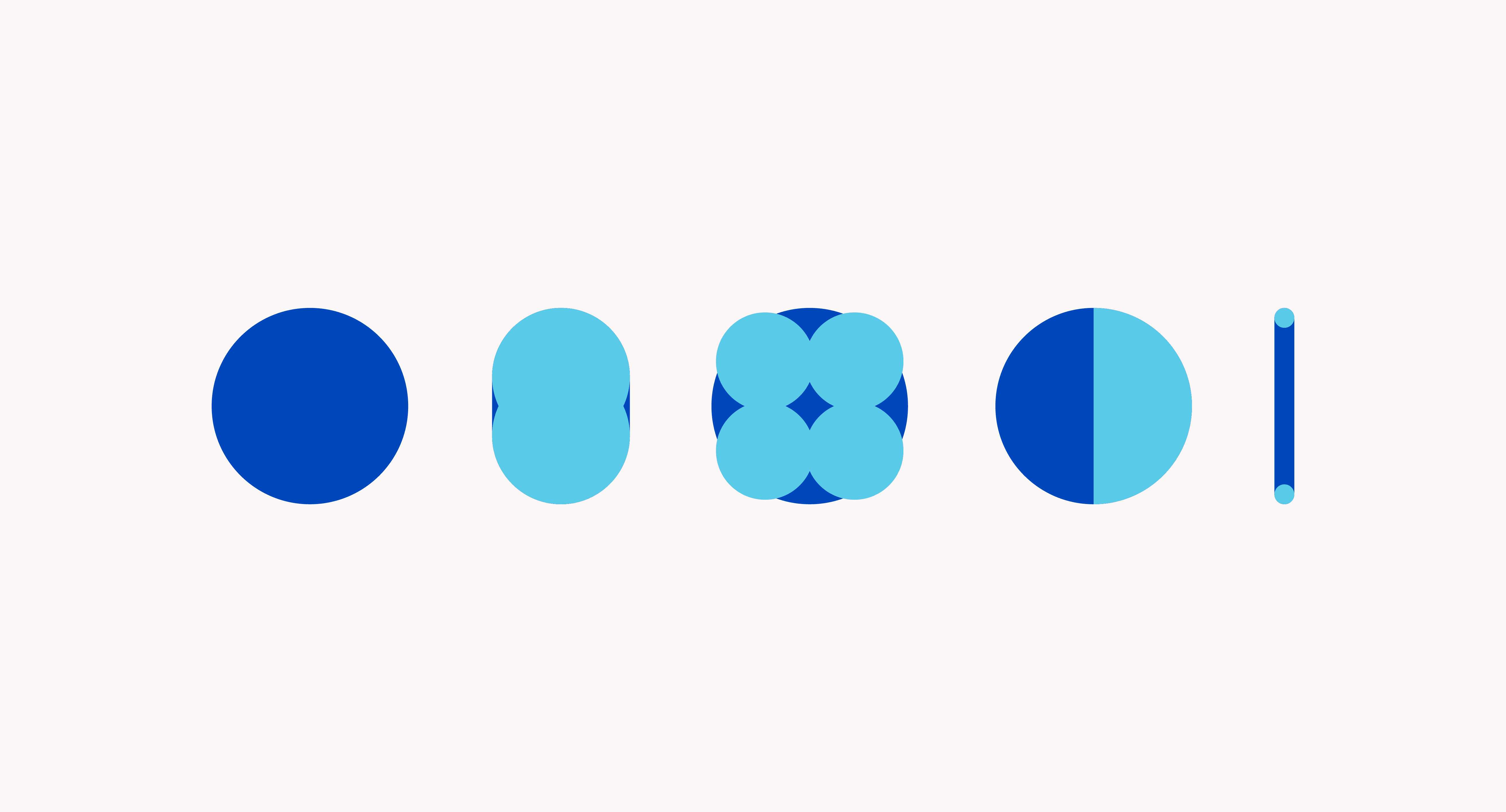
To create MIG’s rich and immersive brand environment, we invented a distinct visual language from the ground up. To express simplicity through form, we started with a circle. From a simple circle, we developed a core set of shapes that would allow us to create a rich visual language for the brand.
Iconography
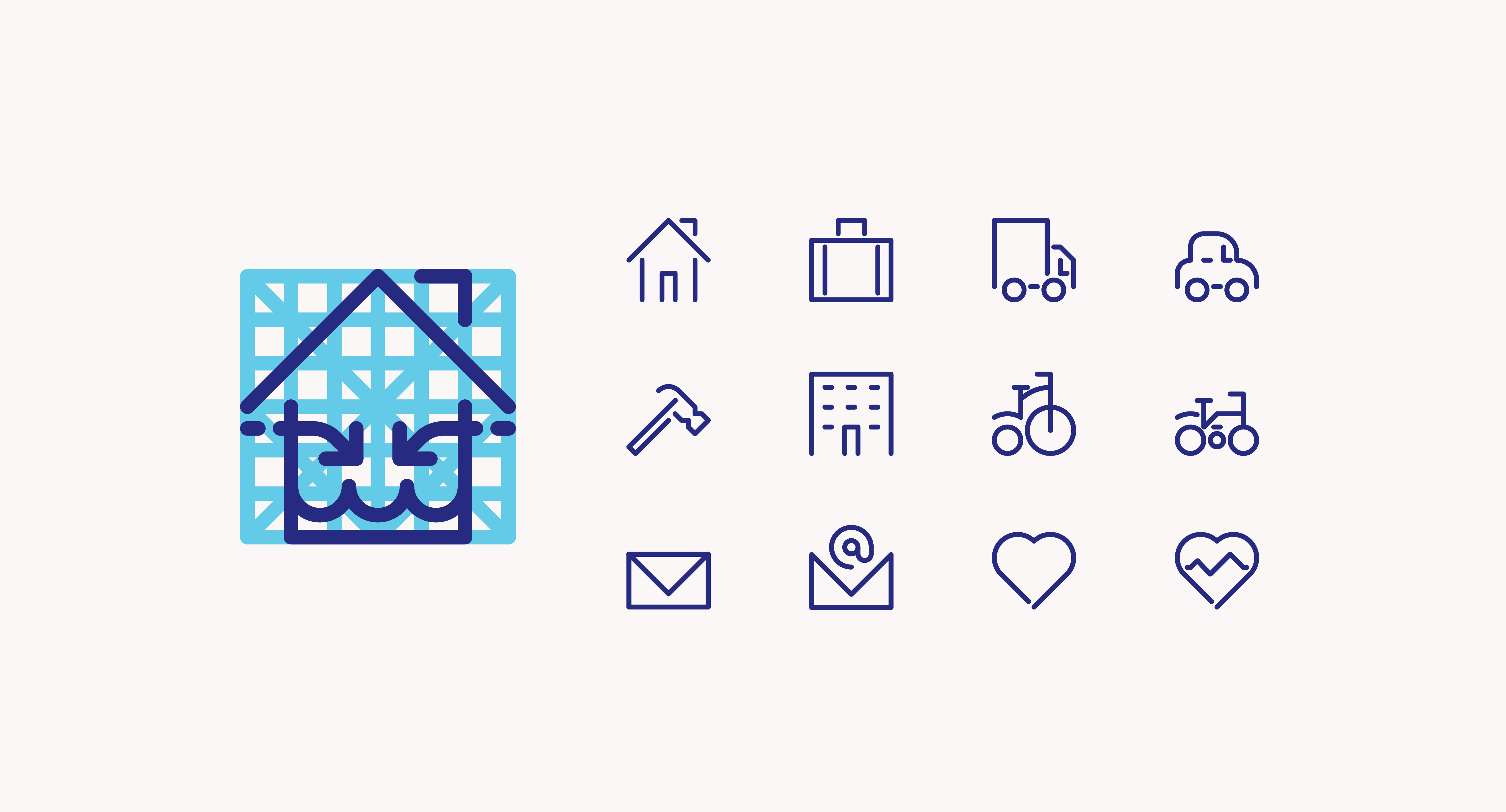
With this framework, we began articulating MIG’s brand identity by creating a set of proprietary icons. This would allow us to create quick visual identification icons for MIG’s range of products.
Illustrations
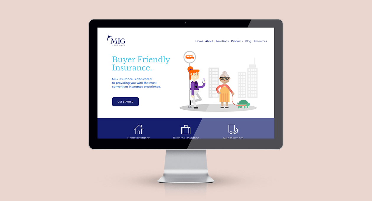
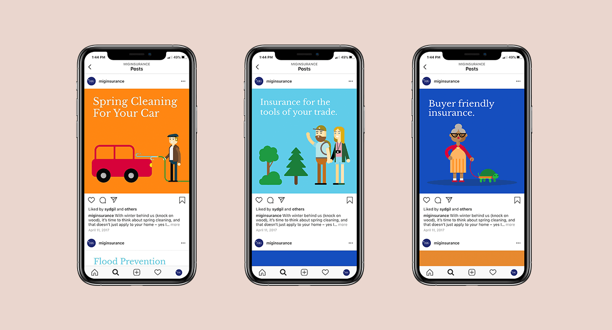
To provide a seamless brand environment, we used our visual language and an illustration style to create ‘a world where insurance is bought, not sold’. MIG is now able to demonstrate in clear, simple, and branded terms their diverse product offerings and the nuanced scenarios that relate to their customers.
Our identity work enabled MIG to express a far richer brand experience than any offered by their new competitors.
This identity work ensures MIG can quickly develop key branded marketing pieces that communicate highly complex concepts while competitors may need to rely on generic stock imagery or expensive and time-consuming photo shoots. This illustrated language saves time and resources. MIG can take an original concept to a finished, market ready, branded communication piece in a matter of hours.
